I’m going to admit something: when I first saw Gartner’s “CIO Board Presentation Prep” graphic, I didn’t get it.
I stared at it. I followed the rings. I noted the colors. I tried to decode the shapes — circles for gaps, squares for concerns, triangles for strengths. I watched the triangles point in different directions and wondered what that meant. And after several minutes, I still didn’t understand what decision I was supposed to make from looking at it.
At 66, time is more valuable than ever. And there’s time I spent on that graphic that I’m never getting back.
I’m not afraid to say “I don’t get it.” And I suspect many of you aren’t either — you’ve just never been given permission to say it out loud.
So here it is: If this graphic confused you, you’re not the problem. The graphic is the problem.
Let me show you what I mean.
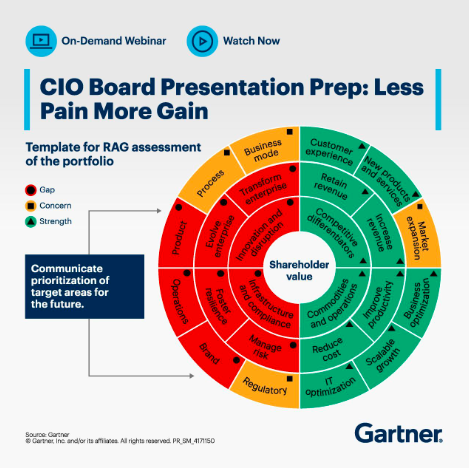
The Secret Decoder Ring
Look at the legend:
- 🔴 Circle = Gap
- 🟨 Square = Concern
- 🟢 Triangle = Strength
Now look at the wheel itself. The triangles point in different directions — up, down, sideways — within each segment. What does the orientation mean? There’s no legend for that.
Gartner has layered three encoding systems on top of each other:
- Color (red/yellow/green)
- Shape (circle/square/triangle)
- Orientation (triangle direction)
All to communicate “prioritization of target areas for the future” — something that could be accomplished with a simple ranked list.
This isn’t a strategic framework. It’s a decoder ring — the kind you’d find in a 1950s cereal box. It looks exclusive. It feels important. But unless you have the codebook, it’s meaningless.
And here’s the kicker: even with the codebook, there are still no connections between the pieces.
The Three-Step Reveal
Let me decode it for you.
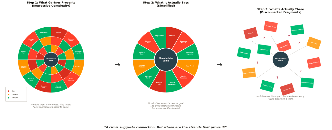
Step 1: What Gartner Presents Multiple rings. Color codes. Tiny labels. Shapes within shapes. It feels sophisticated. It’s hard to parse. That’s the point.
Step 2: What It Actually Says Strip away the noise and you have 12 priorities arranged around a central goal: “Shareholder Value.” The circular design implies these areas are connected. The shared center suggests integration.
Step 3: What’s Actually There Disconnected fragments. Puzzle pieces floating in space. No influence mapping. No impact analysis. No interdependencies. Just 12 silos arranged in a circle.
Authority Theater
Here’s what I’ve come to understand: the complexity isn’t a bug. It’s a feature.
CIOs are under enormous pressure to demonstrate they understand and control IT’s strategic value to the board. Presenting an overly complex, authoritative graphic allows them to project competence while avoiding the uncomfortable questions:
- How does “Reduce Cost” impact “Customer Experience”?
- What happens to “Market Expansion” when “Business Continuity” turns red?
- Is this organization actually ready to execute any of these priorities?
The wheel doesn’t answer those questions. It doesn’t even ask them. It just looks like it does.
Twelve silos arranged in a circle don’t become integrated just because they share a center point.
The Boardroom Silence
I suspect this is what happens when this wheel appears in a board presentation:
The CIO displays it with confidence. The executives nod. Someone asks a clarifying question about the color coding. The conversation moves to the next slide.
And nobody admits they don’t understand how the pieces connect — because admitting that feels like admitting you’re not smart enough to get it.
But there’s nothing to get. The connections aren’t hidden. They’re absent.
This is authority theater. The framework looks so sophisticated that questioning it feels like exposing your own ignorance. So everyone nods, the presentation continues, and another initiative joins the 80% failure rate.
What’s Actually Missing
A real integration framework would show:
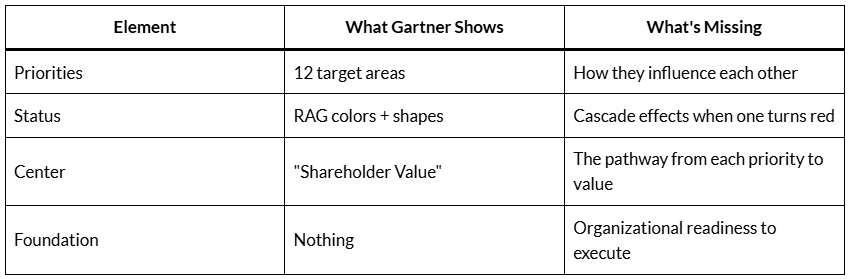
You can’t achieve “Shareholder Value” by pursuing 12 disconnected priorities simultaneously. You achieve it by understanding which priorities are dependencies, which are enablers, which conflict, and which sequence matters.
The wheel shows none of that. It just arranges vocabulary in a circle and calls it strategy.
The Question That Changes Everything
Before your next board presentation, try this: pick any two adjacent segments on the wheel and explain, specifically, how a change in one affects the other.
How does improving “Customer Experience” impact “Reduce Cost”? Does it increase cost or decrease it? Over what timeframe? With what dependencies?
How does “Manage Risk” connect to “Market Expansion”? Are they in tension? Are they sequential? Does one enable the other?
If you can’t answer those questions with specifics, you don’t have a strategy wheel. You have a vocabulary list arranged in a circle.
From Authority Theater to Accountability Questions
My simplified version isn’t just clearer — it converts authority theater into accountability questions.
Instead of asking “What is the status of these 22 things?” it forces the conversation to shift to:
- What are the structural reasons we keep failing?
- What is our actual readiness to execute?
- Where are the connections between these priorities?
That’s uncomfortable. That’s why Gartner’s version exists — it allows organizations to feel strategic without answering the uncomfortable questions.
You’re Not Missing Anything
Here’s what I want you to take away from this:
You are not missing what Gartner is saying. You are seeing what it carefully avoids saying.
The confusion you felt looking at that wheel wasn’t your limitation. It was your instinct recognizing that something essential was absent.
The shapes, the colors, the rotating triangles, the nested rings — all of it creates the appearance of sophisticated analysis. But appearance isn’t insight. Complexity isn’t clarity. And a circle isn’t a system.
The next time someone shows you an impressive circular framework, ask one question: “Where are the connections?” If they can’t show you the strands that link these pieces together, you’re looking at a decoder ring, not a clarifying tool.
You tell me which one this is.
P.S. — I ran this graphic past 5 different AI models. All came back with similar responses to mine. What does that tell you?
-30-

donosb1973
December 15, 2025
what did the Ai model say about who is the x